
나만의 코딩 일지
[HTML/CSS] transition 속성 본문
transition
- 선택자가 변화되거나 혹은 동작이 있을 때 시간의 흐름을 부여하여 변화시키는 속성
transition과 함께 사용 가능한 속성들
- 사이즈 관련 : width, height, mergin, padding
- 선 관련 : border-width, border-color, border-radius
- 색상 관련 : color, background-color, opacity
- 변환 관련 : transform
- 위치 관련 : top, left, right, bottom
transition 속성
- transition-delay : 지연 값, 변환되는 시간을 지연시키는 속성 ex) transition-delay: 1s -> 1초 후 실행
- transition-duration : 몇 초 동안 재생할지, 변환되는 시간을 작성하는 속성 ex) transition-duration: 1s -> 1초 동안 실행
- transition-property : 변화되는 CSS를 구분하여 따로 처리 ex) transition-property: 속성명, 속성명; (all 전체 선택 가능), transition-property:width, background-color;
- transition-timing-function : 변화되는 시간에 속도를 부여하는 속성(= 수치 변형 함수)
- linear : 시작부터 끝까지 같은 속도
- ease : 기본 값 (천천히 시작 ~ 빨라진 후 천천히 끝낸 속도)
- ease-in : 속도의 시작이 느리게
- ease-out : 속도의 끝이 느리게
- ease-in-out : 느리게 시간 ~ 느리게 끝
한꺼번에 적용
- transition : 속성들을 한 번에 처리하는 속 기법으로 여러 개의 속성을 동시에 적용 가능
- 속성(property) - 시간(duration) - 이징(duration) - 지연(delay)
- ex) transition: all 1.5s ease 0.5s; -> 전체의 요소들이 1.5초의 시간을 가지며 ease의 변화로 0.5초 후 시작된다.
사용법
- transition-delay 사용법
<head>
    <meta charset="UTF-8">
    <meta http-equiv="X-UA-Compatible" content="IE=edge">
    <meta name="viewport" content="width=device-width, initial-scale=1.0">
    <title>Document</title>
    <style>
        * {
            padding: 0;
            margin: 0;
        }

        #header {
            width: 700px;
            overflow: hidden;
            border: 5px solid #000;
            position: absolute;
            top: 50%;
            left: 50%;
            margin-top: -350px;
            margin-left: -400px;

        }

        .line:nth-child(1) {
            width: 50px;
            height: 50px;
            background-color: aquamarine;
            margin: 20px;
            transition-delay: 0s;
            /*0초 딜레이*/
        }

        .line:nth-child(2) {
            width: 50px;
            height: 50px;
            background-color: burlywood;
            margin: 20px;
            transition-delay: 1s;
            /*1초 딜레이*/
        }

        .line:nth-child(3) {
            width: 50px;
            height: 50px;
            background-color: coral;
            margin: 20px;
            transition-delay: 2s;
            /*2초 딜레이*/
        }

        .line:nth-child(4) {
            width: 50px;
            height: 50px;
            background-color: darkgreen;
            margin: 20px;
            transition-delay: 3s;
            /*3초 딜레이*/
        }

        .line:nth-child(5) {
            width: 50px;
            height: 50px;
            background-color: darkorchid;
            margin: 20px;
            transition-delay: 4s;
            /*4초 딜레이*/
        }

        #header:hover .line {
            width: 610px;

        }
    </style>
</head>
<section>
    <div id="header">
        <div class="line"></div>
        <div class="line"></div>
        <div class="line"></div>
        <div class="line"></div>
        <div class="line"></div>
    </div>
</section>

</body>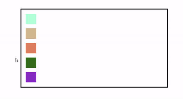
- transition-duration
<head>
    <meta charset="UTF-8">
    <meta http-equiv="X-UA-Compatible" content="IE=edge">
    <meta name="viewport" content="width=device-width, initial-scale=1.0">
    <title>Document</title>
    <style>
        * {
            padding: 0;
            margin: 0;
        }

        #header {
            width: 700px;
            overflow: hidden;
            border: 5px solid #000;
            position: absolute;
            top: 50%;
            left: 50%;
            margin-top: -350px;
            margin-left: -400px;

        }

        .line:nth-child(1) {
            width: 50px;
            height: 50px;
            background-color: aquamarine;
            margin: 20px;
            transition-duration: 0s;
            /*0초 동안 실행*/
        }

        .line:nth-child(2) {
            width: 50px;
            height: 50px;
            background-color: burlywood;
            margin: 20px;
            transition-duration: 1s;
            /*1초 동안 실행*/
        }

        .line:nth-child(3) {
            width: 50px;
            height: 50px;
            background-color: coral;
            margin: 20px;
            transition-duration: 2s;
            /*2초 동안 실행*/
        }

        .line:nth-child(4) {
            width: 50px;
            height: 50px;
            background-color: darkgreen;
            margin: 20px;
            transition-duration: 3s;
            /*3초 동안 실행*/
        }

        .line:nth-child(5) {
            width: 50px;
            height: 50px;
            background-color: darkorchid;
            margin: 20px;
            transition-duration: 4s;
            /*4초 동안 실행*/
        }

        #header:hover .line {
            width: 610px;

        }
    </style>
</head>
<section>
    <div id="header">
        <div class="line"></div>
        <div class="line"></div>
        <div class="line"></div>
        <div class="line"></div>
        <div class="line"></div>
    </div>
</section>

</body>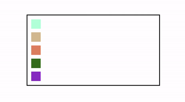
- transition-property 사용법
<head>
    <meta charset="UTF-8">
    <meta http-equiv="X-UA-Compatible" content="IE=edge">
    <meta name="viewport" content="width=device-width, initial-scale=1.0">
    <title>Document</title>
    <style>
        * {
            padding: 0;
            margin: 0;
        }

        #header {
            width: 700px;
            overflow: hidden;
            border: 5px solid #000;
            position: absolute;
            top: 50%;
            left: 50%;
            margin-top: -350px;
            margin-left: -400px;

        }

        .line {
            width: 50px;
            height: 50px;
            margin: 20px;
            background-color: cadetblue;
        }

        /* 각각 같은 색상에서 커서를 박스에 올렸을 때 각각 다른 배경 색상과 폭 값의 변화 과정 */
        #header:hover .line:nth-child(1) {
            width: 210px;
            background-color: aquamarine;
        }

        #header:hover .line:nth-child(2) {
            width: 310px;
            background-color: burlywood;
        }

        #header:hover .line:nth-child(3) {
            width: 410px;
            background-color: coral;
        }

        #header:hover .line:nth-child(4) {
            width: 510px;
            background-color: darkgreen;
        }

        #header:hover .line:nth-child(5) {
            width: 610px;
            background-color: darkorchid;
        }

        #header:hover .line {
            width: 610px;
        }

        .line {
            transition-property: width, background-color;
            transition-duration: 3s, 1s;
            /* 배경 색상을 3초 동안, 폭 값은 1초 동안 변화 */
        }
    </style>
</head>
<section>
    <div id="header">
        <div class="line"></div>
        <div class="line"></div>
        <div class="line"></div>
        <div class="line"></div>
        <div class="line"></div>
    </div>
</section>

</body>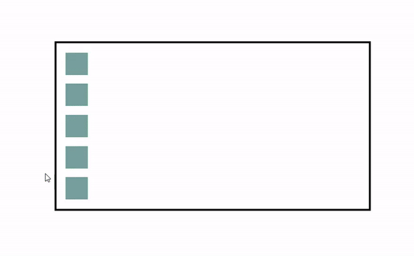
- tansition-timing-function 사용법
<head>
    <meta charset="UTF-8">
    <meta http-equiv="X-UA-Compatible" content="IE=edge">
    <meta name="viewport" content="width=device-width, initial-scale=1.0">
    <title>Document</title>
    <style>
        * {
            padding: 0;
            margin: 0;
        }

        #header {
            width: 700px;
            overflow: hidden;
            border: 5px solid #000;
            position: absolute;
            top: 50%;
            left: 50%;
            margin-top: -350px;
            margin-left: -400px;

        }

        .line:nth-child(1) {
            width: 50px;
            height: 50px;
            background-color: aquamarine;
            margin: 20px;
            transition-timing-function: linear;
            /* 시작부터 끝까지 같은 속도 */

        }

        .line:nth-child(2) {
            width: 50px;
            height: 50px;
            background-color: burlywood;
            margin: 20px;
            transition-timing-function: ease;
            /* 기본 값(천천히 시작 ~ 빨라진 후 천천히 끝낸 속도) */

        }

        .line:nth-child(3) {
            width: 50px;
            height: 50px;
            background-color: coral;
            margin: 20px;
            transition-timing-function: ease-in;
            /* 속도의 시작이 느리게 */

        }

        .line:nth-child(4) {
            width: 50px;
            height: 50px;
            background-color: darkgreen;
            margin: 20px;
            transition-timing-function: ease-out;
            /* 속도의 끝이 느리게 */

        }

        .line:nth-child(5) {
            width: 50px;
            height: 50px;
            background-color: darkorchid;
            margin: 20px;
            transition-timing-function: ease-in-out;
            /* 느리게 시작 ~ 느리게 끝 */

        }

        #header:hover .line {
            width: 610px;
        }

        .line {
            transition-duration: 3s;
        }
    </style>
</head>
<section>
    <div id="header">
        <div class="line"></div>
        <div class="line"></div>
        <div class="line"></div>
        <div class="line"></div>
        <div class="line"></div>
    </div>
</section>

</body>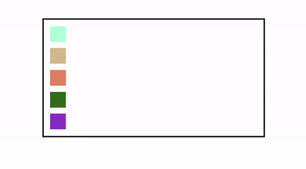
'HTML' 카테고리의 다른 글
| [HTML/CSS] 반응형 웹(RESPONSIVE WEB) - 가변 그리드 (0) | 2022.06.28 |
|---|---|
| [HTML/CSS] animation(애니메이션 속성) (0) | 2022.06.28 |
| [HTML/CSS] transform 속성 (0) | 2022.06.27 |
| [HTML/CSS] 위치 속성(position, z-index) (0) | 2022.06.27 |
| [HTML/CSS] 웹 폰트 (0) | 2022.06.27 |
'HTML' Related Articles
more


